BeBold
BeBold
BeBold guides SaaS teams to scale confidently with user-first product, brand, and design strategy.
Brand strategy
We wanted to position BeBold as more than a consultant, but rather a trusted strategic advisor for SaaS and tech leaders ready to grow with intention. Acting as a bridge between product, brand, and design, BeBold helps build strong foundations for long-term, sustainable growth.
We wanted to position BeBold as more than a consultant, but rather a trusted strategic advisor for SaaS and tech leaders ready to grow with intention. Acting as a bridge between product, brand, and design, BeBold helps build strong foundations for long-term, sustainable growth.
Honest
Supportive
Personable
Strategic
Pragmatic
Fearless
Insightful
Empowering
confident
Bold
Audience
SaaS & tech companies ready to scale sustainably with a user-first mindset
Promise
Empower your product and brand to grow boldly with clarity and strategy.
Tone
Strategic, empowering, and warm — always honest and clear.
Edge
Product, Brand, and Design unified into user-first systems that scale.
Logo design
The BeBold logo combines modernity with a spark of creativity. A clean sans-serif typeface balances the inviting color palette, while the bolded “BOLD” emphasizes the core brand value of fearlessness and confidence.
The asterisk is a nod to the shorthand for bold text in Slack, symbolizing both emphasis and the spark of innovation that drives BeBold forward.
Color Palette
BeBold’s color palette combines confident, bold hues with grounded, modern tones — striking the balance between energy and trust. These colors reflect our fearless approach, user-first mindset, and commitment to clarity in every product and brand we help grow.
BeBold’s color palette combines confident, bold hues with grounded, modern tones — striking the balance between energy and trust. These colors reflect our fearless approach, user-first mindset, and commitment to clarity in every product and brand we help grow.
Typography
BeBold’s typography is clean, modern, and approachable, reflecting a balance of strategic clarity and human warmth. The slightly rounded letterforms keep messaging confident yet friendly, making complex ideas feel accessible and actionable for SaaS and tech leaders ready to scale.
BeBold’s typography is clean, modern, and approachable, reflecting a balance of strategic clarity and human warmth. The slightly rounded letterforms keep messaging confident yet friendly, making complex ideas feel accessible and actionable for SaaS and tech leaders ready to scale.
Barlow
Barlow
Barlow is a slightly rounded, low-contrast, grotesk type family. Drawing from the visual style of the California public, Barlow shares qualities with the state's car plates, highway signs, busses, and trains.
Barlow is a slightly rounded, low-contrast, grotesk type family. Drawing from the visual style of the California public, Barlow shares qualities with the state's car plates, highway signs, busses, and trains.
Barlow
Barlow
Barlow is a slightly rounded, low-contrast, grotesk type family. Drawing from the visual style of the California public, Barlow shares qualities with the state's car plates, highway signs, busses, and trains.
Barlow is a slightly rounded, low-contrast, grotesk type family. Drawing from the visual style of the California public, Barlow shares qualities with the state's car plates, highway signs, busses, and trains.
Imagery
Our visual approach for BeBold makes use of natural lighting, candid, minimalism, with muted cool tones to portray a calm and productive ambiance. This helps the audience to visualize what it is like working with BeBold. For graphics, we went with bold, dynamic colors and shapes.
Overall, these design elements suggest a brand that is modern, innovative, and dynamic. They convey a message of energy and professionalism, which resonates well with a tech-savvy audience.


Website
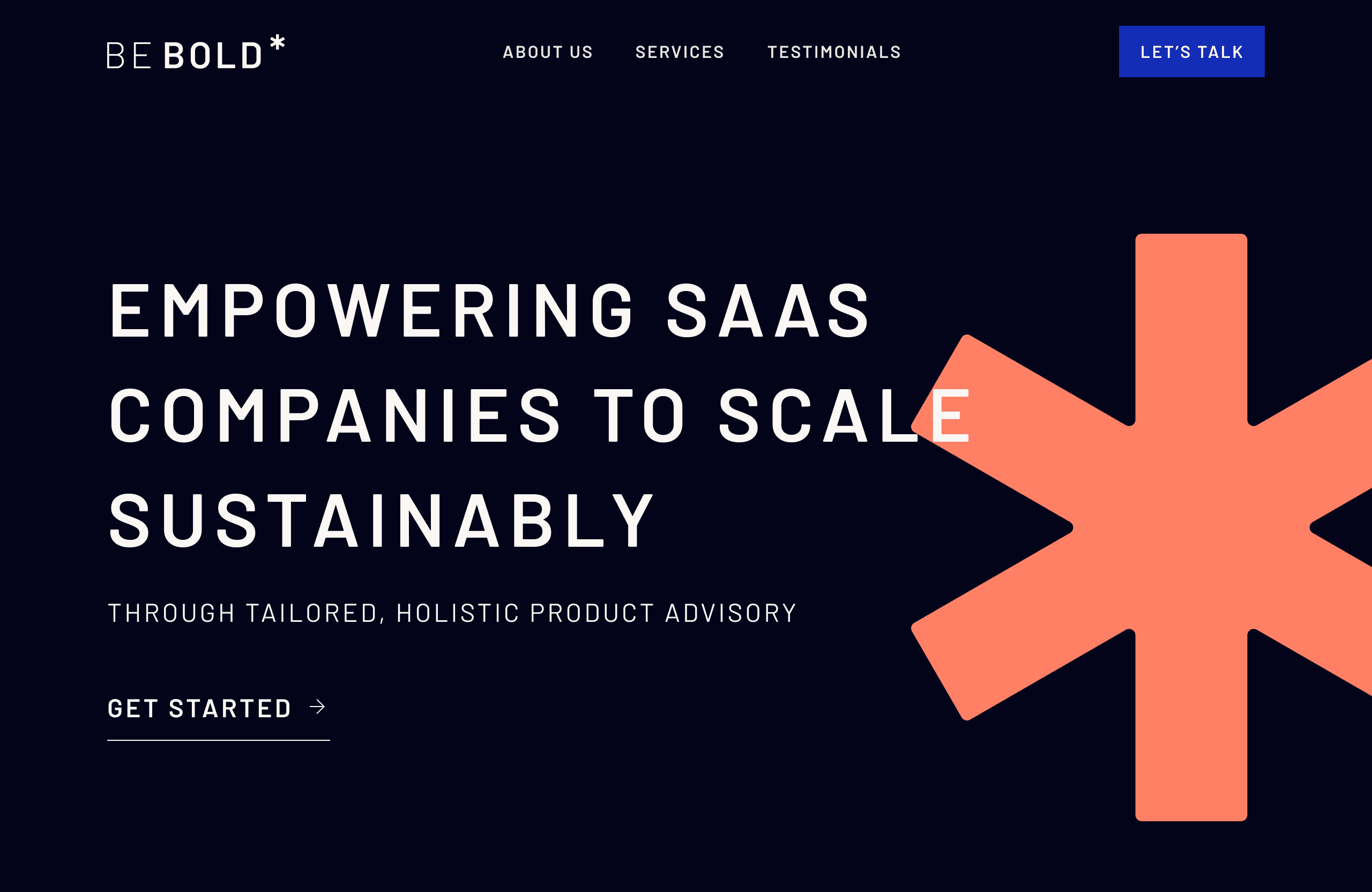
Designed to feel bold, clear, and empowering, the website shows how BeBold bridges Product, Brand, and Design to help SaaS and tech companies grow sustainably and fearlessly. Punchy visuals and straightforward content reflect the clarity and confidence clients can expect.
Designed to feel bold, clear, and empowering, the website shows how BeBold bridges Product, Brand, and Design to help SaaS and tech companies grow sustainably and fearlessly. Punchy visuals and straightforward content reflect the clarity and confidence clients can expect.