Vendor Box
Vendor Box
Vendor Box helps businesses choose the right CRM with clarity and zero guesswork.
Brand strategy
Vendor Box’s brand strategy positions it as a modern, smart, friendly solution for finding the right CRM. Everything, from the website to the search tool is designed to remove stress and make choosing a CRM feel unbiased, accurate, and easy for growing businesses.
Vendor Box’s brand strategy positions it as a modern, smart, friendly solution for finding the right CRM. Everything, from the website to the search tool is designed to remove stress and make choosing a CRM feel unbiased, accurate, and easy for growing businesses.
Helpful
Friendly
Clear
Trustworthy
Modern
Tech-forward
Smart
Non-intimidating
Audience
Business owners & teams ready to choose the right CRM for their needs.
Promise
Find the best-fit CRM, clearly & confidently
Tone
Friendly, smart, and reassuring
Edge
Unbiased, data-backed matches AI can't fully replicate
Logo design
The Vendor Box logo mark uses bold, simple shapes to create the negative space of an open box, tying it back to the name, while also symbolizing the transparency and clarity at the heart of the brand. The upward angles hint at growth and smart decisions, while the warm, balanced colors keep it friendly and approachable.
The Vendor Box logo mark uses bold, simple shapes to create the negative space of an open box, tying it back to the name, while also symbolizing the transparency and clarity at the heart of the brand. The upward angles hint at growth and smart decisions, while the warm, balanced colors keep it friendly and approachable.
Color Palette
The Vendor Box palette combines deep, trustworthy blues with bright, energetic oranges — balancing clarity, confidence, and a spark of optimism. This mix keeps the brand feeling modern, friendly, and ready to guide growing businesses with ease.
The Vendor Box palette combines deep, trustworthy blues with bright, energetic oranges — balancing clarity, confidence, and a spark of optimism. This mix keeps the brand feeling modern, friendly, and ready to guide growing businesses with ease.
Typography
Vendor Box’s typography is clear, modern, and quietly futuristic — reflecting the brand’s vision to transform how businesses discover the right tools. Space Grotesk’s clean, geometric letterforms feel fresh and forward-thinking, while its approachable shapes keep the experience warm and trustworthy.
Vendor Box’s typography is clear, modern, and quietly futuristic — reflecting the brand’s vision to transform how businesses discover the right tools. Space Grotesk’s clean, geometric letterforms feel fresh and forward-thinking, while its approachable shapes keep the experience warm and trustworthy.
Space Grotesk
Space Grotesk
Space Grotesk is a proportional sans-serif typeface variant based on Colophon Foundry's fixed-width Space Mono family (2016). Originally designed by Florian Karsten in 2018, Space Grotesk retains the monospace's idiosyncratic details while optimizing for improved readability at non-display sizes.
Space Grotesk is a proportional sans-serif typeface variant based on Colophon Foundry's fixed-width Space Mono family (2016). Originally designed by Florian Karsten in 2018, Space Grotesk retains the monospace's idiosyncratic details while optimizing for improved readability at non-display sizes.
Poppins
Poppins
Geometric sans serif typefaces have always been popular, and with support for both the Devanagari and Latin writing systems, Poppins is an internationalist addition to the genre. Each letterform is nearly monolinear, with optical corrections applied to stroke joints where necessary to maintain an even typographic color.
Geometric sans serif typefaces have always been popular, and with support for both the Devanagari and Latin writing systems, Poppins is an internationalist addition to the genre. Each letterform is nearly monolinear, with optical corrections applied to stroke joints where necessary to maintain an even typographic color.
Imagery
Vendor Box’s imagery feels modern, calm, and human — spotlighting people in bright, natural light. Simple backdrops and warm color blocking keep the focus on clarity and connection, while everyday moments help connect Vendor Box to what it could look like if you choose the right tools.
Vendor Box’s imagery feels modern, calm, and human — spotlighting people in bright, natural light. Simple backdrops and warm color blocking keep the focus on clarity and connection, while everyday moments help connect Vendor Box to what it could look like if you choose the right tools.


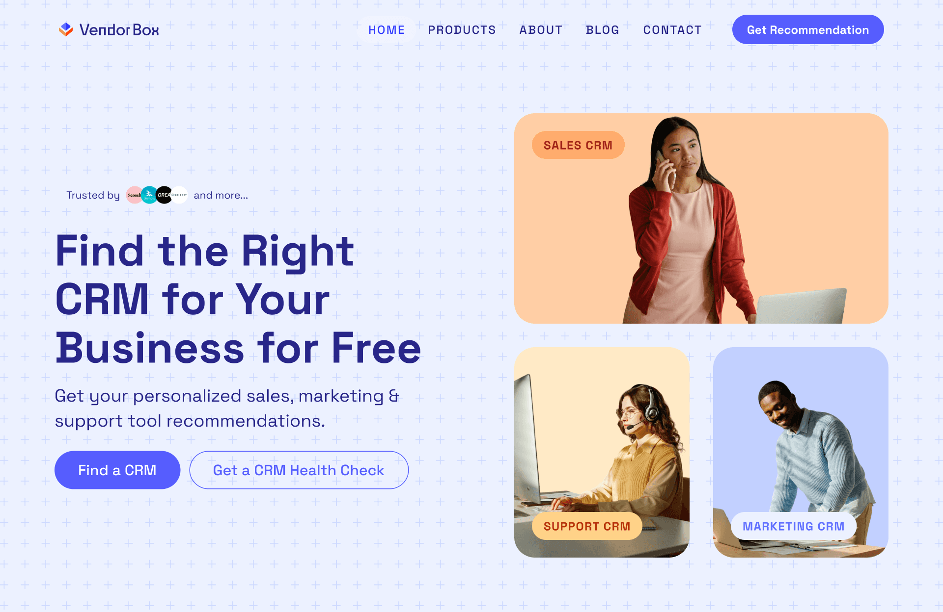
Website
The Vendor Box website is designed to feel clear, approachable, and smart — making it easy for businesses to find the right CRM without the overwhelm. Warm colors and simple interactions build trust and guide visitors forward, reflecting Vendor Box’s mission to bring clarity and confidence to every choice.
The Vendor Box website is designed to feel clear, approachable, and smart — making it easy for businesses to find the right CRM without the overwhelm. Warm colors and simple interactions build trust and guide visitors forward, reflecting Vendor Box’s mission to bring clarity and confidence to every choice.