User Experience
Web Design
Freebie
How to Audit Your Own Website (So It Actually Works for You)
Jul 8, 2025

If you get mildly uncomfortable when someone asks you for your website, you’re not alone.
As I tell my clients, your business evolves over time and, let’s be honest, you’re busy working on your day-to-day tasks to keep things running. It’s natural to get to a point where you see that your website needs a little TLC (or a full face-lift).
So what can you do to make sure that you know when you’ve hit that point where you need an update?
I’m glad you asked.
An audit is just the thing you need.
What is a website audit and why does it matter?
In my career, I’ve unfortunately seen businesses big and small throw money away at redesigns without having a clear understanding of what is broken. This is where an audit comes in.
I know an audit sounds a bit intimidating and like a lot of work, but it doesn’t have to be. I’ve done audits, and depending on how deep you want to go, it is something YOU yourself can do as well.
Let’s break down what a website audit looks at:
First Impressions: Is it clear what you do and what value you offer?
Navigation: Is it easy for people to find what they need?
Call-to-action: Is it clear and obvious?
Visual consistency: Does it feel aligned with your brand?
Copy: Is your tone of voice consistent with your brand? Is your messaging clear?
Responsiveness: Does it work well on mobile and tablet as well?
First Impressions
Did you know that when someone lands on your site, you have 5-7 seconds to make it clear what you do and why they should care? If your hero section (the top-most section of your website) is vague, full of jargon, or buried under fluff, people will bounce.
A strong first impression should answer:
What do you do?
Who is it for?
What should they do next?
Example of a good hero section:
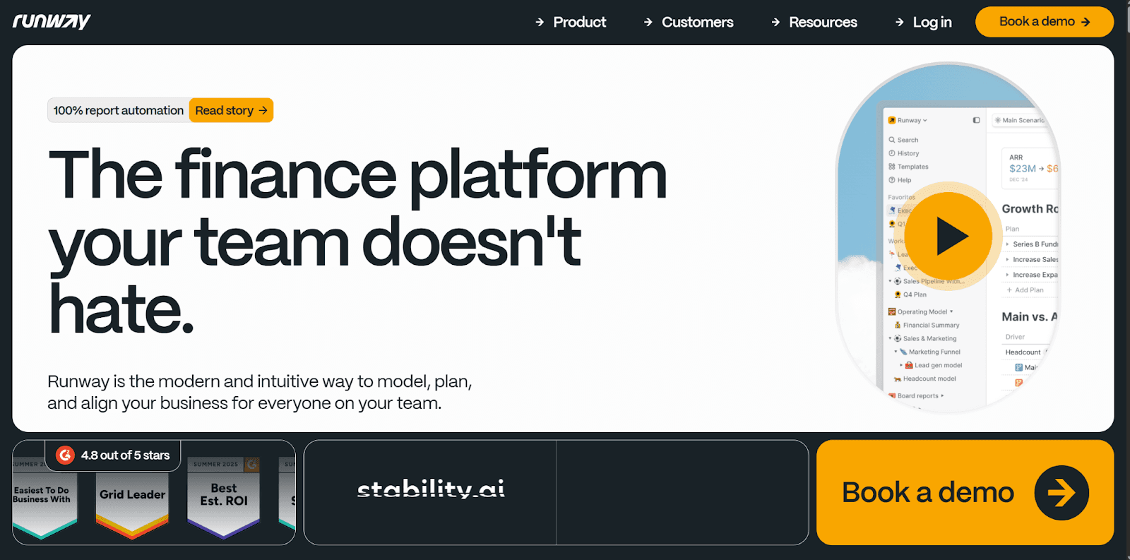
Source: runway.com
Can you guess what this company does?
Can you figure out who this is meant for?
Can you guess what the next step is?
Navigation
Have you ever landed on a website and had a question, but you couldn’t find the answer? Or you did find the answer, but it felt like going through a maze?
Yea, we want to avoid that.
How do we do that?
Check if your menu items are clear, simple, and logical
Make sure people can find your services, about page, and contact info in 2 clicks or less
Don’t overload your menu with EVERYTHING. 3-5 items is a good rule of thumb.
Example of a good navigation:

Source: buildingremote.co
Can you find what their services are?
Can you find more information about them?
Can you find how to contact them?
Call-to-Action
Also affectionately referred to as CTAs. Every page should have a clear primary next step. Whether that is booking a call, filling out a form, or learning more. If your CTA is hidden, vague, or missing, you’re leaving conversions on the table.
Another important consideration is that it should also be directly tied to the goal of your website.
Is your website meant to allow people to book? Is your website purely informational? Or is it meant to direct people somewhere else?
Here are some rules-of-thumb for your call-to-action:
Use an action word
Keep it 5 words or less
Make it obvious and descriptive of what happens next
Make it stand out from other buttons on the site
Example of a good CTA:
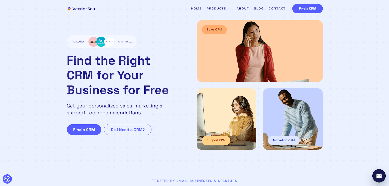
Source: vendorbox.io
Do you know what the next step on this page is?
Can you understand what happens if you click on the button?
Can you differentiate what the primary action is vs. secondary actions?
Visual Consistency
Have you ever been on a company’s social media and when you click to go to their website, you question whether you were on the right page?
Yea, that’s bad.
Your visuals should look and feel like they belong together. If everything feels pieced together, or off-brand, people may question your credibility. This is everything from:
Colors
Fonts
Images (photos and illustrations)
Icons
Example of good brand consistency:
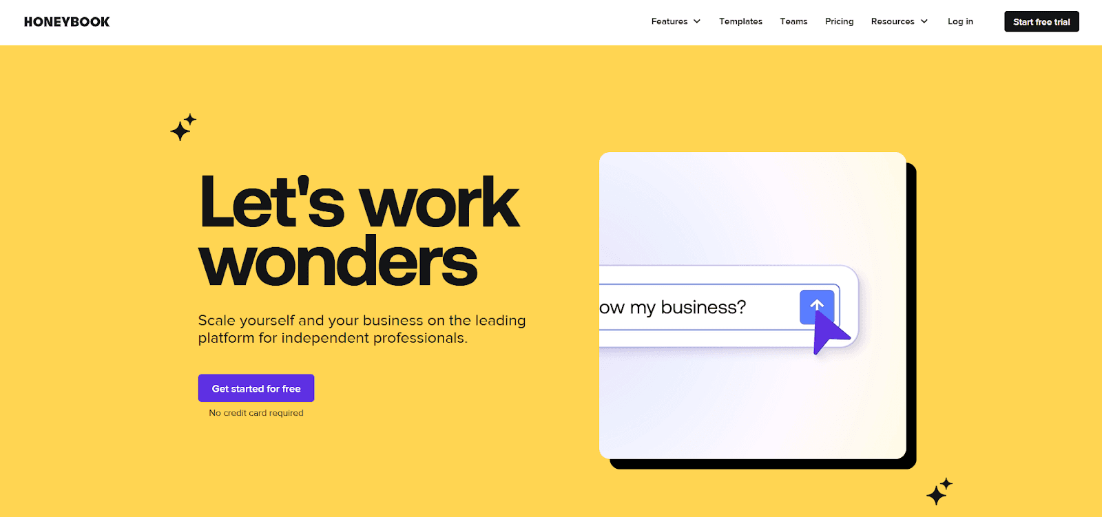
Source: honeybook.com

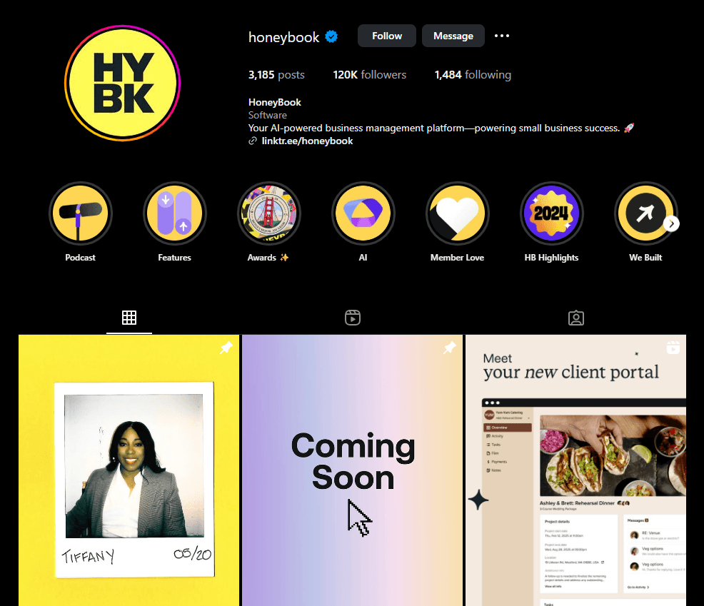
Do the colors look consistent?
Do the fonts match across the brand?
Does the imagery look similar?
Does the iconography feel like they match?
Copy
Great visuals draw people in, but words make them stay. Good copy is actually a lot trickier to nail, because similar to design, you need to first define what your tone of voice is (and why).
More importantly, you need to intimately understand your audience. It’ll be so much harder to write content that resonates with them if you don’t understand who they are, what their goals are, and why they would want to work with you.
Here are some things to keep in mind when looking at the copy on your website:
Ensure that it’s consistent
Keep it jargon-free and easy to understand
Make sure that it’s value-driven
Example of good copy:

Source: deel.com
Does it sound like it’s the same tone as the rest of my brand?
Is it easy to understand and free of jargon-y content?
Is the content value-driven?
Responsive
More than half your visitors are probably checking you out on a phone or tablet. With that in mind, it’s more important than ever to ensure your site looks good and works smoothly on all devices.
Text isn’t getting cut off
Images aren’t getting warped or clipped
Spacing is appropriate for the screen size
Buttons and interactive items aren’t too small for big fingers
Example of a website adjusted for mobile:

Source: vendorbox.io
Are buttons tappable/clickable across screen sizes (i.e. not too big or small)?
Do images fit the screen size without getting clipped or warped?
Does the spacing feel appropriate (not too big or small)?
Does the text feel like the right size?
What next?
Your website should work as hard as you do — and a quick audit can help you see what’s helping (and what’s holding you back). If you’ve gone through these questions and found a few things to fix — that’s a win. Clarity is always the first step.
If you’d like an easy version you can print or fill out as you go, grab my free Website Audit Worksheet — the same one I use to help clients see what’s working and what needs a tune-up.
And if you’d like a second pair of eyes or help turning your audit into a plan — I’m here for you. You don’t have to DIY it alone
Here’s to websites that feel clear, honest, and true to you.
You’ve got this!.